Saturday, May 26, 2007

Falkestrasse-Coop Himmelb(l)au: Modelled in SketchUp, Rendered in Cheetah3D


Here we are again...I've made a few changes that make the model much more accurate -- and watertight. I'll leave it to the eagle-eyed among you to spot the differences


The classic Zugmann interior -- I found a perfect .3ds model of the Eames EA 105 chair -- exactly the one in the original. So, It was cleaned up in SketchUp and exported. It makes a big, big difference to the overall feel of the image. The Model was downloaded from the Herman Miller repository. Here's a link to the Zugmann Photo for reference.

This shot was rendered with Area lights in Cheetah. There's an incredible feel to the light quality. Compare it to the render in the first post at the bottom of the page to see the difference.

Here's the Zugmann narrow shot, but this time I've rendered it in Cheetah3D using Area lights. These give a much better feel to the lighting and the shadows are much, much more realistic. I'll be re-doing all the shots using this technique.

A view from the balcony, giving a good view of the canopy structure. You just have to love the way they've taken the beam that braces the canopy back to the main structure and shoved it through the baluster.


A similar view as the previous (but a more accurate model), rendered using Area Lights in the amazing Cheetah3D. The light in this is just so much more realistic, and for not much of an increase in render time. Also, the "letterbox" aspect ratio gives excellent 'drama' to the shot.

This image I've included here because it almost exactly matches the viewpoint in the previous image – even the shadows are nearly identical. Also included because it was chosen by SketchUp to grace their stand at the recent American Institute of Architects Convention in San Antonio, Texas.


The final, full-length animation, rendered using Radiosity and HDRI in the excellent Cheetah3D. At a resolution of 480x360 this took 60 hours to render on a quad-core Mac Pro 2.0 GHz. I'm now using an excellent little video editor by the name of Norkross Movie to edit these animations together. This embedded video has been upgraded to take advantage of YouTube's new 'High Quality' setting.


Above, a SketchUp-generated FlyThrough of the most accurate model to date, for comparison with the above animation. This embedded video has been upgraded to take advantage of YouTube's new 'High Quality' setting

Here are some QTVR panoramas rendered using Cheetah3D. I'm amazed by how much spatial information can be crammed into these tiny files. This panorama is rendered from the centre of the main conference room space. You may need to download QuickTime for Windows to view these. Another panorama, this time rendered from the balcony overlooking the main conference space. I'm indebted to Rory Kelleher of Headshift.com for the code for embedding these in webpages.

Labels:

Sunday, October 15, 2006

Falkestrasse-Coop Himmelb(l)au: Modelled in SketchUp, Rendered in Cheetah3D

A model of the famous Falkestrasse Dachaufbau by Austrian architects Coop Himmelb(l)au. A bit of judicious texture mapping and some post-processing work in Photoshop has tied the whole thing together nicely. Modelling in SketchUp, lighting, rendering and animation (see above for a fly-through) in Cheetah.

Friday, October 13, 2006

Falkestrasse - Coop Himmelb(l)au - A Model in SketchUp: Exteriors

Well, it was a dirty job, but someone had to do it...Every architecture student's wet dream, the Falkestrasse Roof Remodelling in Vienna by Coop Himmelblau.
I had been meaning to tackle this one for years – I thought it was just about the hardest thing I could set myself to model in SketchUp. And it was pretty difficult – but I succeeded with SketchUp where I'd failed with other heavyweight modellers like form•Z and LightWave. I had to work from photos out on the web – No plans or sections. And there's very little printed material – no monographs, for example – for such an iconic structure. However, a friend, Jeff Jacobs, sent me some scans of the original Architectural Review article from 1987, which contained some structural axonometrics. Not the easiest drawings to fathom, but helped tremendously in revealing 'hidden details'. I'd say, as it stands, it's about 85% accurate. I still know what needs to be put right...
As an aside, is it Himmelblau (Sky Blue) or Himmelbau (Heavenly Building)? Answer: it's both.They parenthesize the 'L' so you can have it both ways, the funsters.


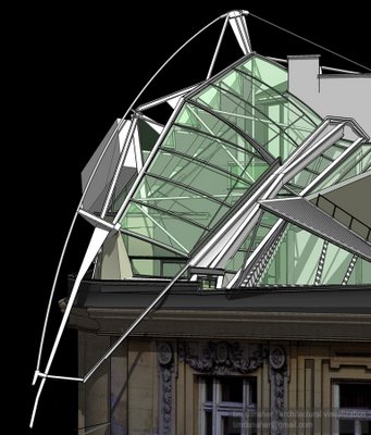
One of the great things about building models is being able to see the building from unexpected angles. I love the drama of this widescreen close-up, and it gives you a glimpse through to the little-seen rear end of the development.

The same view as the previous, but rendered using HDRI in my favourite renderer, Cheetah3D. Amazing that radiosity renders like this can be knocked out in a few minutes. Well, you can on a Mac Pro. This is actually a render of a later model than the SketchUp render above it.

Again, a view you'll never get to see. Here you can see how the entire bow truss is tied back to the prismatic structure on the balcony/mezzanine level. I don't know how this is anchored, though. If you've ever thought that the whole thing looks as if it's balanced on the edge of the roof – well, that's because it is.


Finally, the classic view that everyone's familiar with, with the actual background from the original Architectural Review cover photo doing duties as an HDRI source, and setting the building nicely in its environment. A bit of judicious texture mapping to the building itself will bring it all together nicely.
If you squint, it looks quite real

Falkestrasse – Coop Himmelb(l)au - A model in SketchUp: Interiors

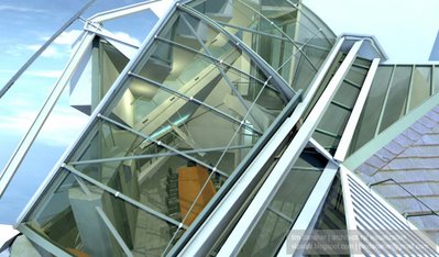
Again, a little-seen view from the balcony, with a good view of the canopy and folded plate. There's a light fitting at balcony level (see previous original) that I can't quite figure out. The magazine shot is here for comparison.

A view looking up at the balcony, standing in the main meeting room space (just behind the table, in fact). Since this is a SketchUp render, the shadows are extremely harsh – SU has no internal or ambient light sources, only the sun. Also this had to be rendered out in version 4.0, to counter version 5's well-known 'Shadow Volume' bug.


Taking the model into Cheetah (via FBX) we can take the lighting up to a whole new level. Again, HDRI gives us an almost luminous light quality. The 'blow outs' around the beam that braces the balcony to the canopy and around the exterior walls above the canopy are particularly convincing. I also love the light breakthrough at the back of the folded plate wher it joins the wall.
This image also has a lot of interior light sources: uplighters on the underside of the folded plate; the lamps in the 'girder light'; the fluorescent in the hallway. The neon glow on the tube, is, however, a post-render in Photoshop using layer effects. Cheetah doesn't support that lighting model yet.

Here's a try-out using Soft Shadow mapping...a bit rough, but quite effective...and it could produce a way out of the 'flickering shadow' problem.


Of course, this only works for flat, single surfaces...I wonder if SU's engineers could come up with a solution for automatic wrapping...?