Falkestrasse - Coop Himmelb(l)au - A Model in SketchUp: Exteriors
 Well, it was a dirty job, but someone had to do it...Every architecture student's wet dream, the Falkestrasse Roof Remodelling in Vienna by Coop Himmelblau.
I had been meaning to tackle this one for years – I thought it was just about the hardest thing I could set myself to model in SketchUp. And it was pretty difficult – but I succeeded with SketchUp where I'd failed with other heavyweight modellers like form•Z and LightWave. I had to work from photos out on the web – No plans or sections. And there's very little printed material – no monographs, for example – for such an iconic structure. However, a friend, Jeff Jacobs, sent me some scans of the original Architectural Review article from 1987, which contained some structural axonometrics. Not the easiest drawings to fathom, but helped tremendously in revealing 'hidden details'. I'd say, as it stands, it's about 85% accurate. I still know what needs to be put right...
As an aside, is it Himmelblau (Sky Blue) or Himmelbau (Heavenly Building)? Answer: it's both.They parenthesize the 'L' so you can have it both ways, the funsters.

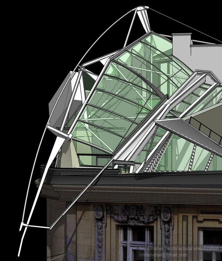
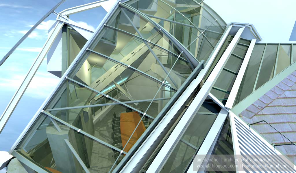
One of the great things about building models is being able to see the building from unexpected angles. I love the drama of this widescreen close-up, and it gives you a glimpse through to the little-seen rear end of the development.
 The same view as the previous, but rendered using HDRI in my favourite renderer, Cheetah3D. Amazing that radiosity renders like this can be knocked out in a few minutes. Well, you can on a Mac Pro. This is actually a render of a later model than the SketchUp render above it.
Again, a view you'll never get to see. Here you can see how the entire bow truss is tied back to the prismatic structure on the balcony/mezzanine level. I don't know how this is anchored, though. If you've ever thought that the whole thing looks as if it's balanced on the edge of the roof – well, that's because it is.

Finally, the classic view that everyone's familiar with, with the actual background from the original Architectural Review cover photo doing duties as an HDRI source, and setting the building nicely in its environment. A bit of judicious texture mapping to the building itself will bring it all together nicely.
If you squint, it looks quite real
posted by Tim Danaher at 5:56 pm
![]()
![]()

3 Comments:
That looks awesome Tim!
Nice design! I like the modern design with the traditional old buildings.
Not your normal all rounder designs you normally get. It catches the eye!
Fantastic! How did you get the arc's so smooth with Sketch Up? Mine are always pixelated and don't have the smoothness you have. Did you clean it up in photoshop with Bezier curves?
No Photoshop. But I'm afraid I don't understand your question...e-mail (link at top of page) me with some examples, maybe I can help.
Post a Comment
<< Home