Falkestrasse-Coop Himmelb(l)au: Modelled in SketchUp, Rendered in Cheetah3D
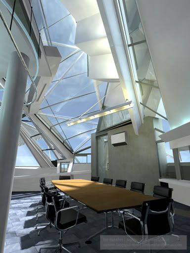
The classic Zugmann interior -- I found a perfect .3ds model of the Eames EA 105 chair -- exactly the one in the original. So, It was cleaned up in SketchUp and exported. It makes a big, big difference to the overall feel of the image. The Model was downloaded from the Herman Miller repository. Here's a link to the Zugmann Photo for reference.
This shot was rendered with Area lights in Cheetah. There's an incredible feel to the light quality. Compare it to the render in the first post at the bottom of the page to see the difference.
 Here's the Zugmann narrow shot, but this time I've rendered it in Cheetah3D using Area lights. These give a much better feel to the lighting and the shadows are much, much more realistic. I'll be re-doing all the shots using this technique.
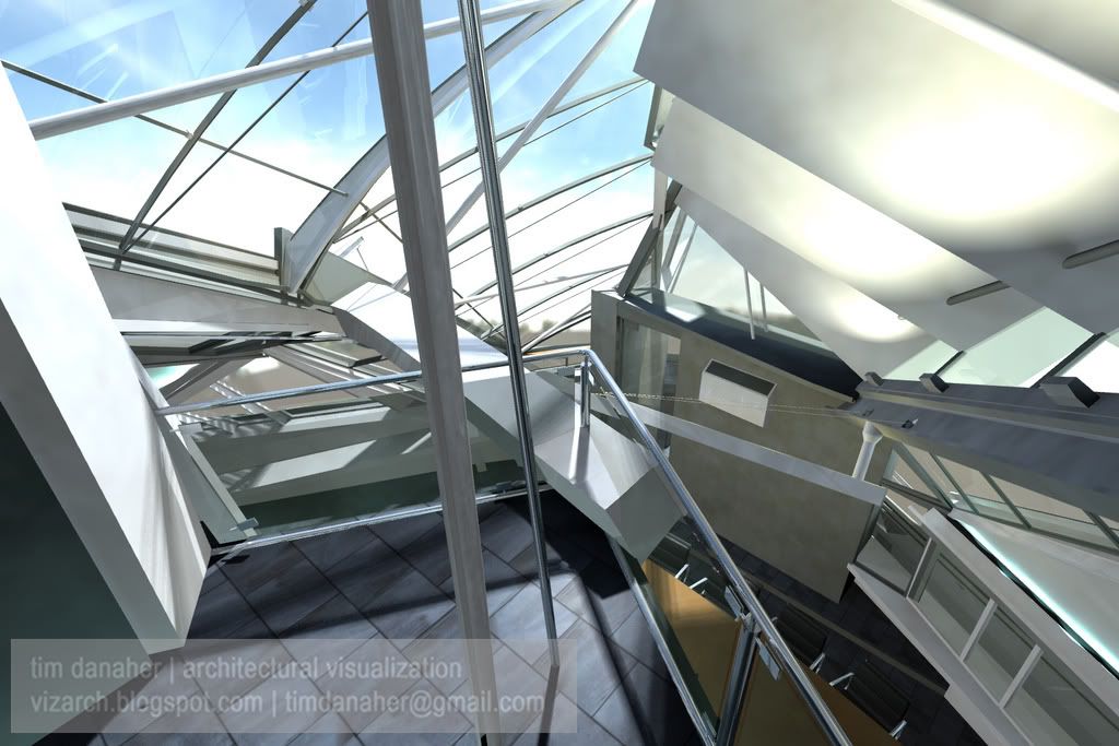
  A view from the balcony, giving a good view of the canopy structure. You just have to love the way they've taken the beam that braces the canopy back to the main structure and shoved it through the baluster.
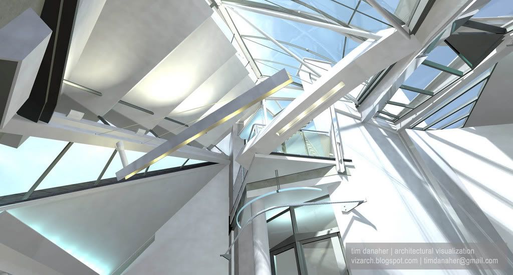
  A similar view as the previous (but a more accurate model), rendered using Area Lights in the amazing Cheetah3D. The light in this is just so much more realistic, and for not much of an increase in render time. Also, the "letterbox" aspect ratio gives excellent 'drama' to the shot.
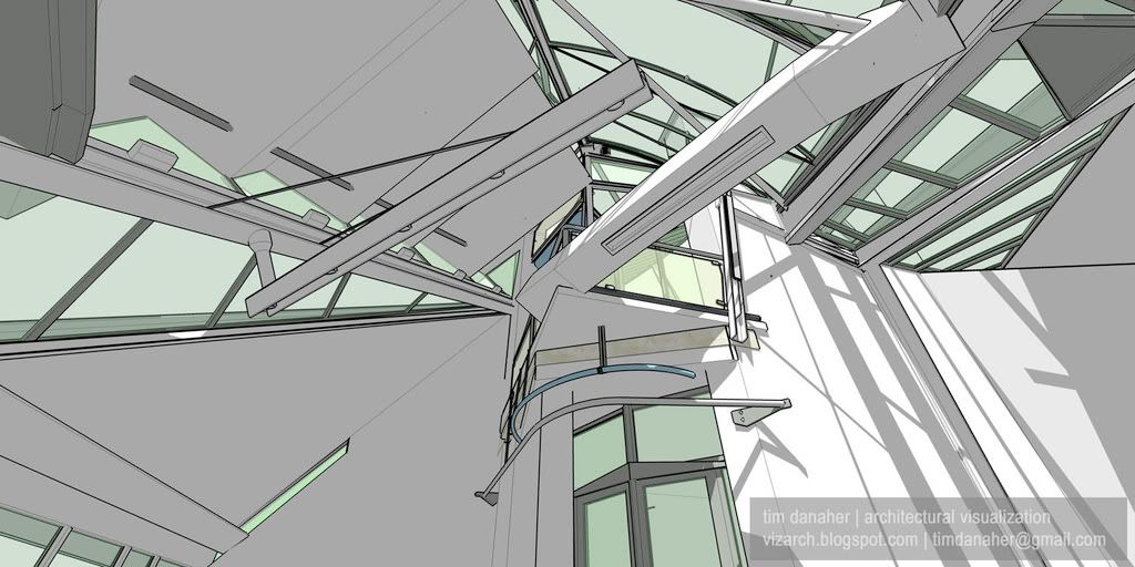
  This image I've included here because it almost exactly matches the viewpoint in the previous image – even the shadows are nearly identical. Also included because it was chosen by SketchUp to grace their stand at the recent American Institute of Architects Convention in San Antonio, Texas.
 The final, full-length animation, rendered using Radiosity and HDRI in the excellent Cheetah3D. At a resolution of 480x360 this took 60 hours to render on a quad-core Mac Pro 2.0 GHz. I'm now using an excellent little video editor by the name of Norkross Movie to edit these animations together. This embedded video has been upgraded to take advantage of YouTube's new 'High Quality' setting.
Above, a SketchUp-generated FlyThrough of the most accurate model to date, for comparison with the above animation. This embedded video has been upgraded to take advantage of YouTube's new 'High Quality' setting
Here are some QTVR panoramas rendered using Cheetah3D. I'm amazed by how much spatial information can be crammed into these tiny files. This panorama is rendered from the centre of the main conference room space. You may need to download QuickTime for Windows to view these. Another panorama, this time rendered from the balcony overlooking the main conference space. I'm indebted to Rory Kelleher of Headshift.com for the code for embedding these in webpages.
Labels: SketchUp Falkestrasse Cheetah3D Coop Himmelblau Danaher


2 Comments:
Hi there Tim, as mentioned this is seriously some great work, it must be very satisfying to have finally modelled this so accurately, and my favourite thing is the boardroom chairs and especially the quality of light in there. Thanks for your advice, i'll keep a lookout for your article in 3DWorld Magazine. It'll be hard for you to top this! Best wishes. Ryan
Thank you!
As for accurate...there are still some gaps that need plugging. I found some of the actual plans for the project that show that the plan of the building is not square – it's about a 105-110 degree corner. This explains why some bits at the back don't fit together the way I wanted them to...
I'll just have to start again one day...
Post a Comment
<< Home